Banana Republic App
Once we’d successfully handed off BR Home and the Banana Republic Apparel website, the Fairwinds team was asked to continue with a redesign of their apparel app. The goal was to seamlessly weave storytelling into the shopping experience, fostering deeper engagement. The challenge was to take a chaotic and distracting UI and transform it into a modern, elegant and user friendly experience that elevated the luxury feel of the brand.
My Role
• User Research, wireframing, prototyping, UI design
• Built and maintained a design system
• Visual design, brand design
The Result
Increased conversions, decreased returned items, increased user engagement and brand loyalty, transition to a more refined and luxury brand identity to support brand initiatives
User Analysis
We asked our users to define the most important issues they had with the app. We analyzed data to see where these problem areas arose:
1. Unclear user journey based on different user personas and goals (browsing vs. looking for specific item)
2. Banana Republic’s sizing is inconsistent and there isn’t trustworthy or helpful information to inform size making decisions.
3. Lack of advanced features like personalized content, try it on features, etc.
We focused on optimizing two different user journeys
Customers looking for inspiration, style guidance, or simply browsing to see what’s new
Create engaging, dynamic content that keeps them browsing, without hiding CTAs or muddying with too much marketing messaging
Customers looking for a specific item
Create a clear path to the item they’re searching for, helpful product information to facilitate a quick and confident purchase, decrease return rates
Homepage
We began by analyzing user behavior and found that unlike the website users, the app users would land on the homepage and almost always navigate directly to the more functional shop page or search. On homepage, users rarely scrolled past the second module.
Given that information, we decided to present BR with two versions. The first was a highly conceptual version that focused on storytelling, new product, and personalized content. We wanted to encourage scrolling, by making that the sole action of the page.

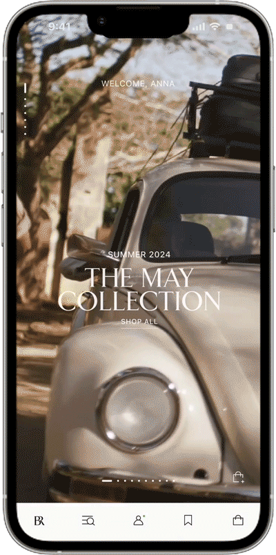
We also designed a more standard vertical scroll version, with modules/components that closely matched the website homepage in content strategy and style.
The BR team decided to take a phased approach, moving towards the more conceptual design while adopting a hybrid version that kept some of the functional and high performing modules from the standard option. This would allow them to test the usability of the more conceptual design and give them time to work through some internal conversations about shared features within the family of brands, like account and promo drawers.
Product Detail Page
Our goal was to Increase personalized content and address sizing issues
We wanted to create merchandizing opportunities with a new ‘Shop The Look’ section. Most importantly, the goal was to decrease friction with our ‘Buy Box’ or item selector, and increase conversion.
We presented the team with two design options. A more standard PDP design with a horizontal scroll hero image carousel and a less typical option with a vertical scroll for product imagery, with a panel overlay for product details.
We saw this paradigm becoming more prominent with competitors, and although it’s not widely used in e-commerce, we believe that users are quickly becoming more familiar. The advantage is that the experience of scrolling through product imagery and additional color ways is quicker and more engaging. Product details are available at any time without cluttering the image or reducing vertical real estate.


Click to view Figma prototype
We provided two different options for an additional merchandizing module: a simple ‘Shop the Look’ module that we felt allowed the user to easily visualize an outfit, as well as a ‘Complete the Look’ module that allows the user to get product recommendations based on occasion. Although this is more complex, it allows for greater personalization. The team decided to A/B test both options.

Navigation
I designed several options and presented the BR team with two: one with a text based list and one with an image list. The team decided to A/B test the two options. I proposed a simplified taxonomy that the team took to leadership and merchandizing for sign off.


Search
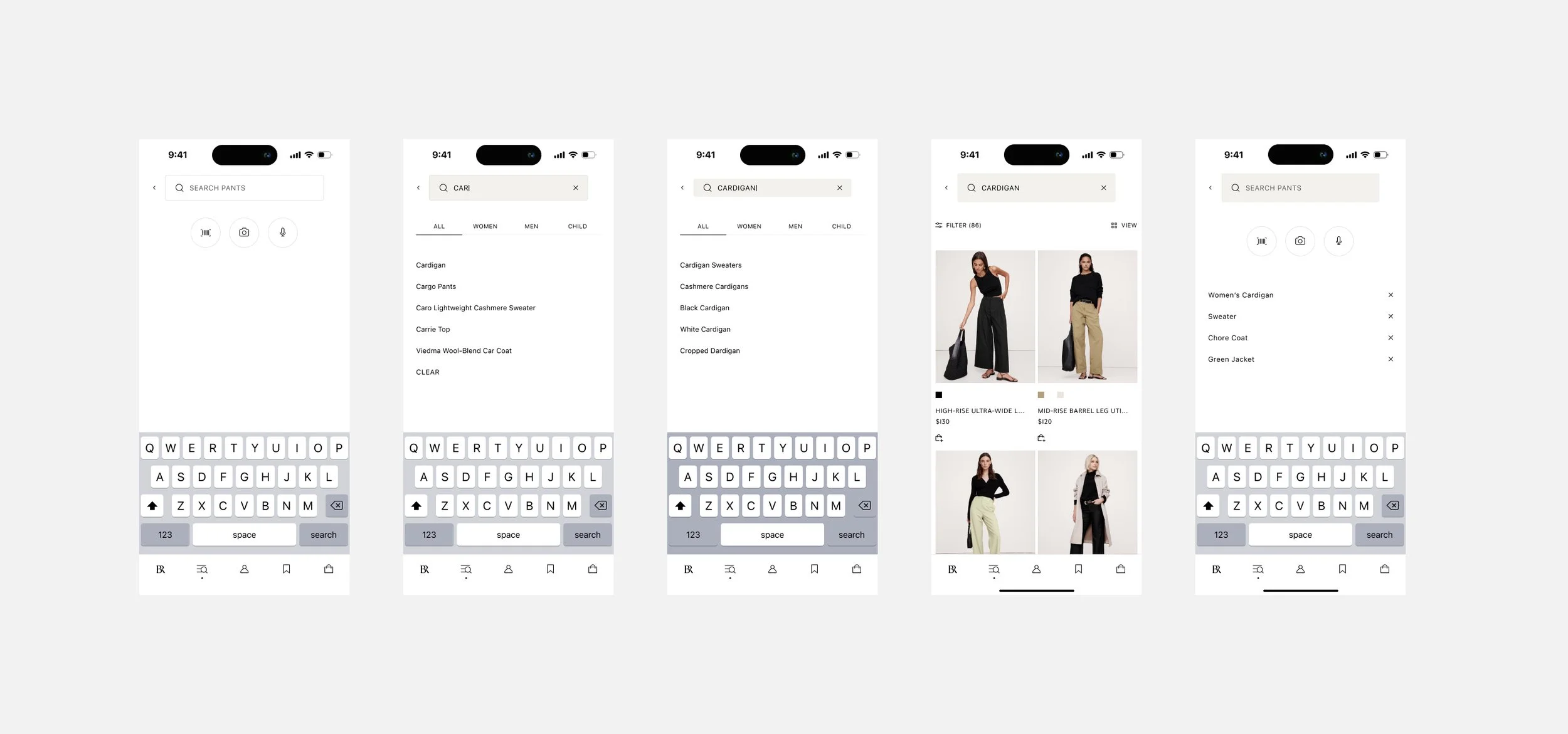
Design System

Homepage Components
Each component had to be flexible with the ability to choose between various CTA styles, hidden or visible product details, and adaptable to header styles and copy lengths. I made each component responsive across breakpoints.
I laid out several examples of how the components could best be used, and provided detailed annotations.
